Starlight Rebrand

Print/Brand Communications

Print/Brand Communications

Print/Brand Communications

Print/Brand Communications

Print/Brand Communications

Print/Brand Communications

Print/Brand Communications

Print/Brand Communications
Print/Brand Communications


Designer(s)
Emily Malcolm
Duration
12 Weeks
Recognitions
Starlight Children’s Foundation Canada
The Starlight Children’s Foundation Canada has a long legacy of supporting children and their family through their health journeys. This foundation inspires others to create change and to support children as they are in and out of hospitals through granting wishes and providing children with toys and care packages. Starlight aims to brighten the lives of children and families going through dark times. They are there to provide support, hope, light, positivity, and some fun for children. These core beliefs are the building blocks for the new Starlight corporate identity. Since Starlight makes wishes come true and welcomes families with open arms, their new corporate identity successfully conveys this through the new logo, fluid elements, colour palette, and typefaces.
The Logo
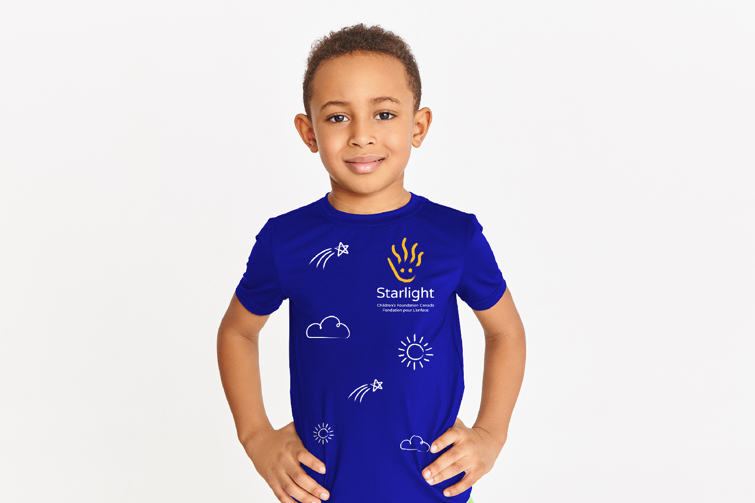
The new logo for Starlight combines a child’s hand to represent support and strength, a smile for positivity, rays of sunshine (the fingers) for light, and a slight bend in the rays to represent an ‘S’ for Starlight. The logo is made from the strokes of a paint brush which creates a looser and more emotional feeling with a less structured humanistic approach. This logo is seamlessly applied to both print and digital materials accompanied by supporting fluid elements. The bright orange/yellow logo against the dark blue background represents the light emanating from the Starlight Children’s Foundation Canada. The main typeface chosen is a rounded sans serif which appears friendly and inviting to children and their families.
Corporate and Collateral Applications
Since Starlight is a foundation, they rely heavily on donations and sponsors to grant wishes and provide children and their families with the support they need. This is why the corporate, collateral, and marketing materials are vital in creating a lasting impact that stands out from other foundations and is more memorable. The new Starlight corporate identity is appropriate for corporate materials while remaining playful and fun to spark joy for children and their families.
Fluid Elements
The fluid elements are just as important as the logo. These elements include the shooting star, cloud, sun, and two different brush strokes used throughout the corporate and collateral materials. Similar to the logo, the fluid elements were created based on some of the core beliefs of the foundation. The sun represents light, the cloud represents dreams, and the shooting star represents hope. The two brush strokes include the brush used for the logo, as well as a crayon inspired brush to remind children to embrace their creativity.


