Covid Cases in Ontario

Information Design

Information Design

Information Design

Information Design

Information Design

Information Design

Information Design

Information Design
Information Design

Interaction Design/Product Design, Other...

Designer(s)
Emily Malcolm
Duration
7 Weeks
Recognitions
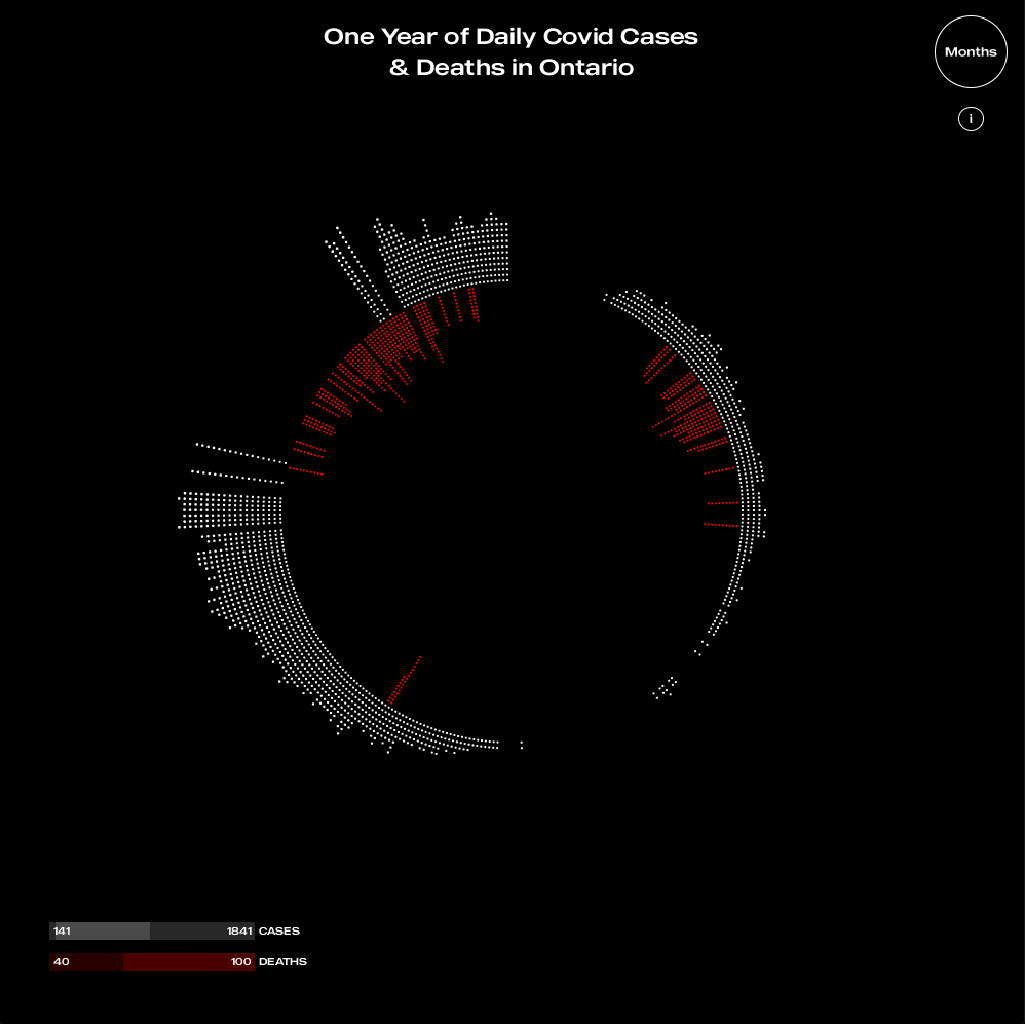
This interactive data visualization model reveals the daily Covid-19 positive cases and deaths in Ontario from March 1st of 2020, until February 28th, 2021. The data was retrieved from covid-19.ontario.ca/data.
What does this visualization answer?
This data visualization plots the daily Covid-19 data on a circle as each white dot represents up to 100 new positive cases, while each red dot represents up to 5 new deaths for each day. This directly compares and contrasts the deaths with the number of positive cases each day for an entire year. The sliders allow the user to isolate data for further inspection of the individual data points. A zoom and pan function allows the user to zoom in on data points to have a deeper understanding of the data and for a more accessible experience. A hover function is implemented to show the distinct separations of months for further clarity and reading of the data set.
Why is this visualization novel?
This visualization is novel because it displays the data in a visually appealing way, while still allowing the data to be portrayed accurately in a digestible format. It also includes interactivity which allows the user to customize their experience reading this data and invites them to immerse themselves in the visualization. The selected data set was chosen in order to bring awareness to the Covid-19 trends in Ontario since the pandemic started. This visualization stands out from the many other Covid-19 visualizations as they display the data in an overwhelming or confusing way, whereas this visualization compiles the information into an impactful, unique, and readable format.
What are the strengths of this visualization?
Some of the strengths of this visualization includes how minimal it is in terms of appearance and data organization which allows the data speak for itself. It creates impact upon first glance and piques the interest of the viewer to encourage engagement and interaction with the data. Other data sets can be imported into the Processing sketch which allows for further comparisons between different provinces in Canada.


