Case Studies

Clutterbug Magazine
When prepositioned with creating an original magazine concept, I knew my topic would center around community. I turned to the community that I both knew and wish I had. Clutterbug became a purposeful fashion voice for young women who want to change their relationship with their clothes and the media they consume. Before establishing branding or content, the first task was to assess who I was designing for. Narrowing down demographics, psychographics, and ethnographics for Clutterbug was key to how I moved forward to looking at what currently exists within these markets. Additionally these laid the foundation for what kinds of content to pursue within the magazine. The key pieces that lead towards specific development were focusing on low to mid income, as well as women who consider themselves creative and handy, repairing things instead of replacing them. It was through this that Clutterbug’s funky maximalist aesthetic was developed.
For the illustrative article, early on I developed a concept of using old computer aesthetics to represent buying old clothes online. This article is very much an example of polishing an idea until it is the most functional it can be, as well as the most enchanting it can be. Over 5 weeks I tweaked and refined, landing on the final layouts, which are interesting and buzzy without overwhelming the reader while also not relying on negative space.

Don't Forget...
Don't Forget, You're Here Forever is a collection of fandom perspectives on the intersections of online queer people and Kpop fandom. Balancing media studies, queer theory, and personal essays, Don't Forget sheds light on western fandom motivations as well as answering why the lesbians like Kpop boys so much.
The book features 8 personal essays, stylishly formatted in a lush and playful way that alludes to the design of Kpop albums. The bright colours interact well with each other and the content at hand.

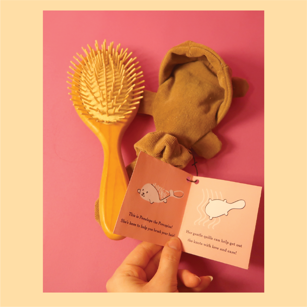
Brush Buds
Many parents will do anything to have their children look presentable and Brush Buds let children think it’s their idea. When assessing the needs of the user I decided to market towards children, and face the common dislike of having their hair brushed due to tugging and knots.
When looking at a hairbrush, its shape lends itself to many ideas: a wand, a microphone, or maybe an animal. Brush Buds turns a simple hairbrush into Penelope the Porcupine, transforming her from just a tool, into a character and toy for children.


