Case Studies

Komunidad
Komunidad (meaning “community” in Tagalog) is a conceptual travelling exhibit that explores the impact of Hip-Hop culture on Filipino-Canadians and Filipino-Americans. With roots in Black culture, Hip-Hop is a vehicle for expression and resistance against oppression for many other minority groups. Hip-Hop—as a catalyst for positive identity formation—creates spaces for Filipino youth in North America to foster community and individuality. Komunidad aims to immerse viewers in an experiential, social, and reflective space.
Drawing from the positive effect of Hip-Hop dance and culture on my own identity as a Filipino-Canadian, I noticed that there was a prevalence of Filipino-Canadians in many Hip-Hop dance communities, such as in the Greater Toronto Area. So, I reached out to other Filipinos and gained 12 responses to the question, “Has Hip-Hop culture impacted your identity as a 1.5/2nd Generation Filipino-Canadian?” Supported by both primary and secondary research, it was found that Hip-Hop has the ability to empower youth, encourage positive identity formation, and build connections among Filipino-Canadians. Quotes from the participants’ insightful responses created the foundation for the graphics of this project.

Touch
Written during a time of isolation, “Touch” recalls the physical nature of human relationships and its connection to our daily lives. “Touch” takes readers on a journey of tactility—moving from the untouched to the touched, and back again—continuously and infinitely. Readers are invited to explore the malleability of this book at their fingertips. Make it twist, turn, stretch, and curve. Let an exploration of “Touch” bring a sense of tangibility and presence in reality.
“Touch” is a 40-signature handmade coptic-bound book that symbolizes the dynamic, changing, and malleable nature of human relationships. With a page size of 3.5 inches by 3.5 inches, this book fits within the palm of the hands. The reader has the power to change the shape and form of the book, just like they have the power to mold their own relationships.

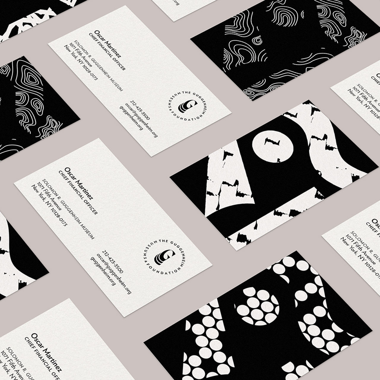
The Guggenheim Rebrand
The Guggenheim Museums & Foundation is a non-profit modern and contemporary art organization with four locations in New York, Venice, Bilbao, and Abu Dhabi. While the current logo of the Guggenheim Museums & Foundation is strong in its simplicity and memorability, I find that it lacks the individuality and memorability of the museums themselves. Furthermore, there is a need for a fluid and unified identity among the museum locations across the globe. Thus, the design challenge is: “How might we re-frame the Guggenheim brand in a fluid identity to unify the four museum locations, express a modern yet timeless visual language, and be inclusive of younger audiences?”


